Written by Vanessa Santos
Every year the experts scour the globe looking for the best interior design trends to integrate into your life, and the color authorities are just one of the many experts that already set their color palette for 2017! If you are thinking just about the Pantone, it’s not the only paint company authority that sets color trends. Actually, that are a lot more and Room Decor Ideas is ready to share with you what the expertises are predicting for the next year.

Greenery by Pantone
As we already talk about it, Pantone declared Greenery the Color of The Year. A lot of articles and famous interior designers gave their thoughts about it and a lot of inspirational interior design mood boards were flooding on the internet with the green hue. Regenerate, refresh, revitalize, renew are the commands.
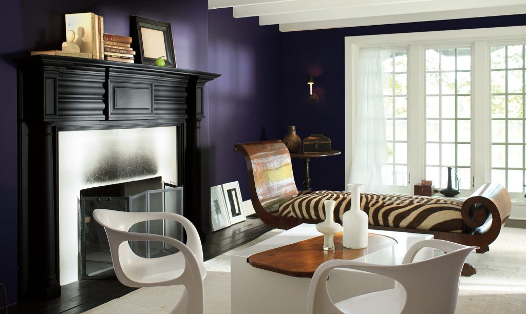
Shadow by Benjamin Moore
Benjamin Moore’s pick turns to be usable, layered hue. “It’s dramatic, which is what the year is. I’ve been over neutrals for a long time”, said company’s creative director, Ellen O’Neill. With no doubt, a seductive color for stylish chic interiors.

Composed by Behr
Though the collection is called “Composed” the palette features deep and intense hues. Rich jewel tones mixed with muddy neutrals make this palette perfect for layering.

Byzantine Blue by Glidden
With a great combination of blue and gray, the Bizantine Blue stretches the boundaries of purple. It appears to be more gray when paired with dark neutrals, yet it appears more bluish-purple when partnered with whites. “Its unique versatility and incredible ability to bring out certain hues” explained Misty Yeomans, PPG color marketing manager.

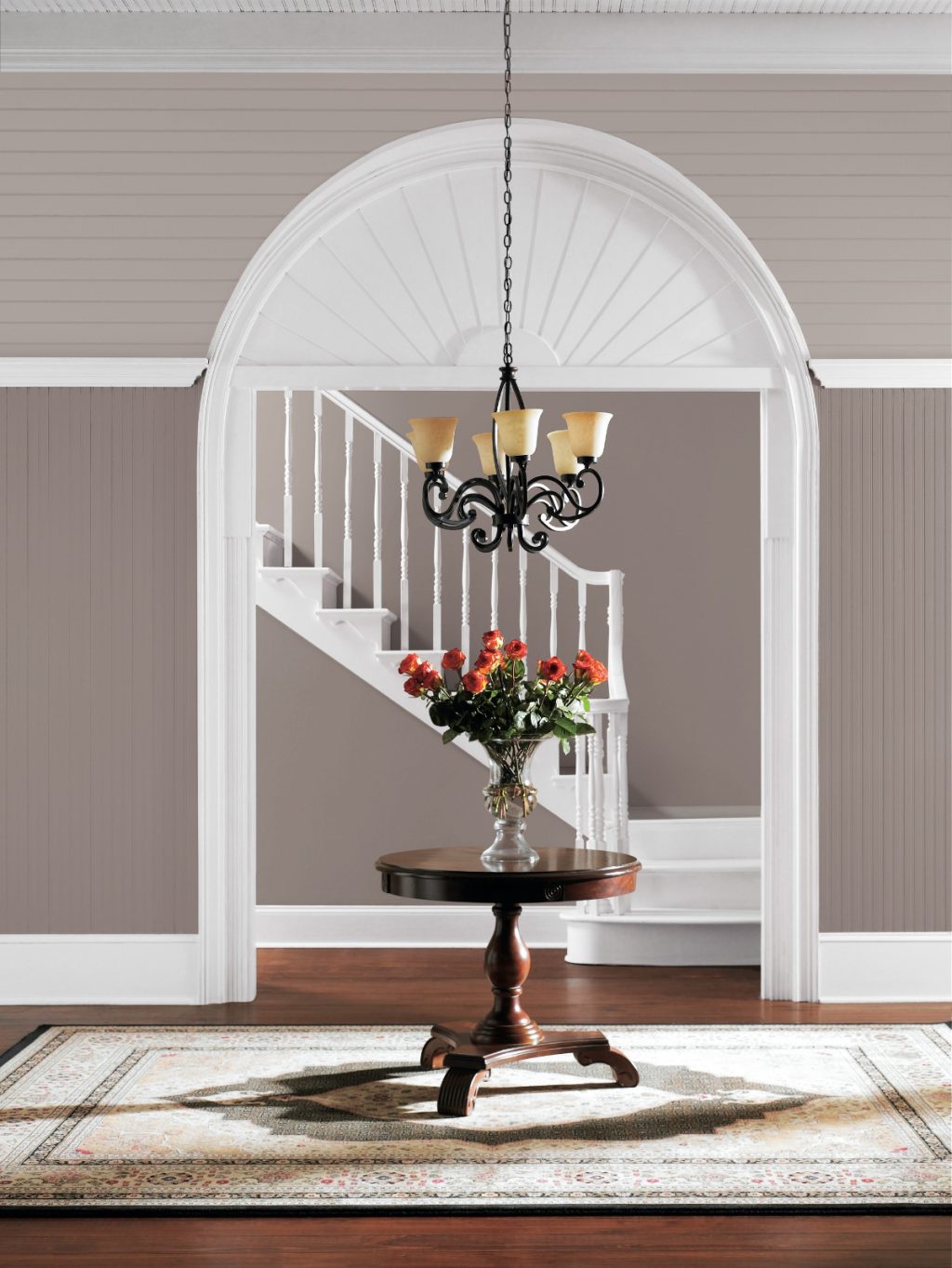
Poised Taupe by Sherwin Williams
Sherwin Williams’s color of the year, Poised Taupe, is a deeper and timeless neutral. A modern hue, classic and a beautiful balance of warm and cool for luxury homes.

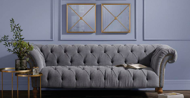
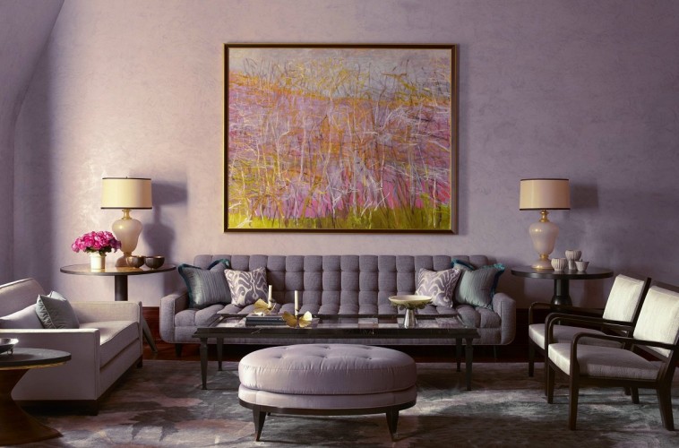
Violet Verbena by PPG
Similar to Pantone’s Serenity and Rose Quartz picks last year, PPG’s Violet Verbena is meant to symbolize a duality of thought. “Consumers now embrace the middle ground between masculine and feminine, young and old, and work and leisure,” says Schlotter. “Violet Verbena’s blending of gray and violet reflects that middle ground.”
Cloudberry by Olympic Paints
The choice of Olympic Paints is a serene soft violet that conveys retreat from the stress of everyday, a keen for relaxation. “Cloudberry conveys retreat from the pressures of daily life, encouraging meditation and mindfulness, inspiring more focus and less stress,” says Dee Schlotter, the senior color marketing manager of the company. A gray-purple hue that idealizes the popular bohemian, lifestyle.
Be inspired by Room Decor Ideas color trends selection!