
Pantone, the Colour Authority Institute, has recently released the best interior design color trends for 2017 and the muted, earthy tones are the winners! With all this inspiration, it will be easier to create the most wonderful color schemes in 2017 to create the perfect room decoration for modern home interiors!
“From the warmth of sunny days with PANTONE 13-0755 Primrose Yellow to the invigorating feeling of breathing fresh mountain air with PANTONE 18-0107 Kale and the desire to escape to pristine waters with PANTONE 14-4620 Island Paradise, designers applied color in playful, yet thoughtful and precise combinations to fully capture the promises, hope and transformation that we yearn for each Spring.”, said in a statement Leatrice Eiseman, Executive Director of the Pantone Color Institute.
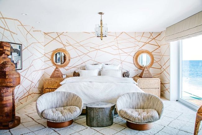
The game of trend-forecasting is already being played and we are ready to see the novelties for stunning rooms. With this new palette with a curated selection of shades, any interior will look more stylish yet welcoming and elegant. From a relaxed blue, or a green that conveys a sense of earthiness, to a vivid tropical orange, here are the colors that’ll be huge come next year.

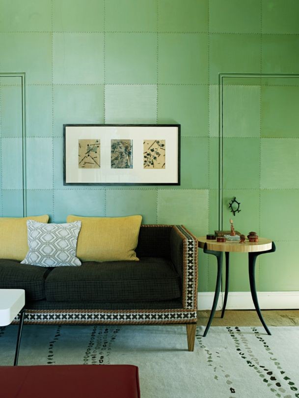
Kale – A lush and fertile natural green that evokes the healthy outdoors.

Hazelnut – A key neutral that effortlessly connects warmth spaces.
Niagara – Comfortable and dependable, the blue that shows our desire for relaxation.
 Greenery – A refreshing green that reinvents any place, where you can take a breath of fresh air.
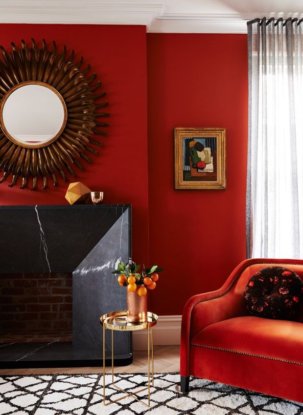
Flame – Flamboyant and vivacious, here’s a orange with a hint of red.
Lapis Blue – Strong and confident, this shade is energetic!

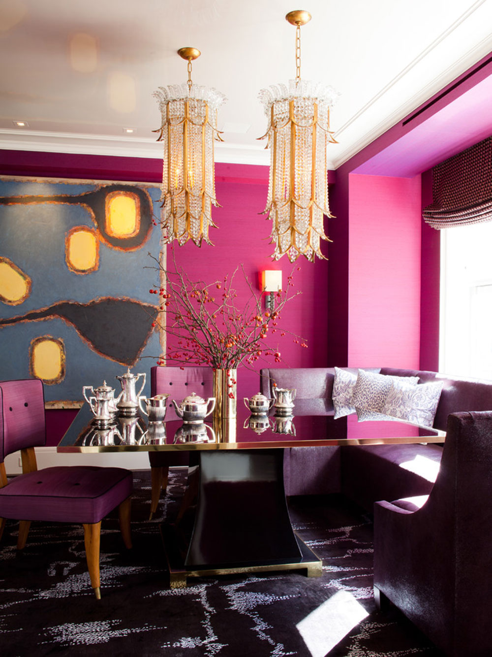
Pink Yarrow – Tropical and festive, here’s a pink that stimulates a room.
Pimrose Yellow – Heat and vitality thru a warmth yellow.

Island Paradise – A refreshing aqua for a calming escape.

Pale Dogwood – A healthy glow that brings a sweet aura of innocence.

So, how do you feel know, are you already inspired? What do you think about trendiest colors according to Pantone? We hope you like it as we do!
Find more color inspiration here:


Hi, It has come to our attention that you are using our client’s photographs on your site without a valid licence. We have already posted out all supporting documents to the address of your office. Please confirm once you have received them. In the meantime, we would like to invite you to settle this dispute by making the below payment of £500. Visual Rights Group Ltd, KBC Bank London, IBAN: GB39 KRED 1654 8703, 1135 11, Account Number: 03113511, Sort Code: 16-54-87 Once you have made the payment, please email us with your payment reference number. Please note that a failure to settle at this stage will only accrue greater costs once the matter is referred to court. I thank you for your cooperation and look forward to your reply. Yours sincerely, Visual Rights Group Ltd, Company No. 11747843, Polhill Business Centre, London Road, Polhill, TN14 7AA, Registered Address: 42-44 Clarendon Road, Watford WD17 1JJ
I loved your blog post.Much thanks again. Great.
I don’t commonly comment but I gotta say regards tips for first time the post on this one :D.