2017 Color Trends Of Pantone for Spring Season
The experienced and wonderful team at Pantone are already preparing the next year color trends. And they made every designer’s heart when they released their color report for Spring 2017. So, Room Decor Ideas decided to compile all this information for you to stay ahead of the trends. Try to incorporate these vibrant colors into your room design.

Hazelnut – A light, warm brown, this shade brings to mind a natural earthiness like the nut itself. It is an excellent color that allows you to pass seasonally without any problem.


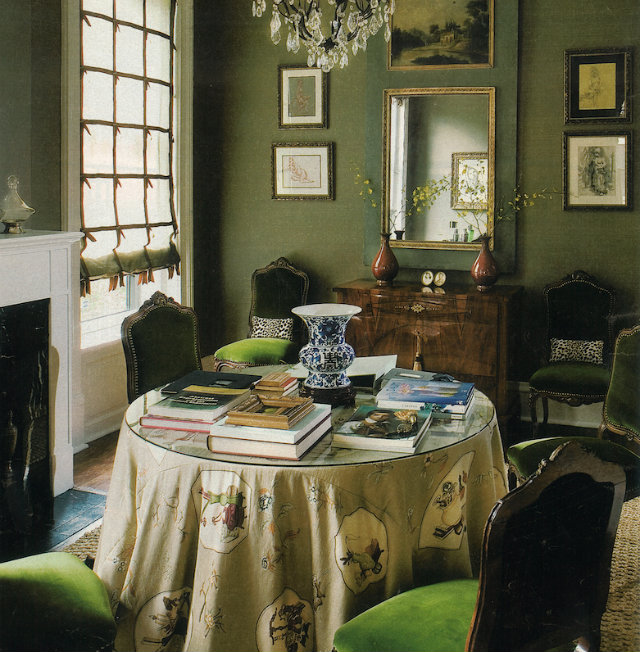
Kale – This color is neutral enough to use all over or as an accent like on the Rita Stool by KOKET.

Pink Yarrow – There aren’t too many colors that you can consider more vibrant that this beautiful and tantalizing pink yarrow and it is very hard to ignore.

Greenery – Although lighter and brighter, Greenery reminds one to take a deep breath, oxygenate and reinvigorate.

This tone transmits a sensation of purity and innocence.

Island Paradise – The Island paradise is all about evoking tropical settings and leaves you dreaming about holidays in paradisiac spots.

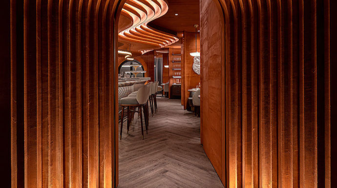
Flame – Flame is the only orange toned color predicted for Spring. If you wish to brighten a darker space, the Flame tone is a great option.
Looking for more trends?! Take a look at these articles:
Interior design color trends for 2017


